Thursday, December 6, 2018

Tessellating Typefaces (part 3)

Three more tessellating typefaces have been added to Myfonts.com. Included is a fourth typeface of birds, TessieXtraBirds. When playing with TesselManiac and before it TesselMania, I have had the tendency to see bird possibilities much more readily than other shapes.
The other two typefaces have a variety of shapes and no clear theme as their names indicate. Below is a poster for TessieMoreStuff. The plane shape has four edges that are all shaped with identical center-point rotation. The poster has them in three different tiling arrangements.

The musical notes from TessieMiscellaneous are a based on a triangle. It is a pattern unlike any that I have seen elsewhere.
Each family contains two styles, a solid style that must be colored and an outline style that can be used alone or layered over the solid style (as shown in the two top illustrations). Each has a sample file that shows what key combination are needed to produce the various patterns that are possible.

(Cross posted at mazepuzzles.blogspot.com)

Sunday, December 2, 2018

More layers


I continue to break apart fonts so that they can be used in layers to make bicolored and tricolored lettering. Recently added to myfonts.com come were additions to Masheen,
 Medieval Gunslinger, and
Zimple.

Tuesday, November 20, 2018

Tessellating Typefaces (part 2)

Three more tessellating typefaces have been added to Myfonts.com. Included is another typeface of birds, TessieMoreBirds. Many of the bird shapes in this typeface are of swimming birds. I noticed that combining two of the swimming birds in the tiling below would result in both swimming and flying birds (shown on the right).  (The flying birds will not tessellate alone.)


 TessieSpinners has a variety of shapes that have suggest spinning or rotating.


Finally, TessieAnimals has tessellating shapes that resemble fish and mammals.


Part 1, with three other tessellating typefaces, is here.

(Cross posted to mazepuzzles.blogspot.com)

Monday, November 19, 2018

More Fontspring revivals

Three more IngrimayneType revivals have been added to fonts offered by Fontspring.com.

XAabced and JasperSqueese are two text fonts with five and six family members respectively. XAabced was an very early attempt to design a readable text font. The two were eventually blended via the merging option of Fontographer to produce JabcedHy, which seems to be superior to both and as a result, the two parent fonts were never added to the font collection at Myfonts.com.

RoundWhy is the result of blending or merging two fonts with reverse contrast, Roundup and WyomingSpaghetti. Roundup has round serifs and WyomingSpaghetti square serifs, so RoundWhy has rounded serifs that are not nearly as rounded as those in RoundUp. For this revival the accented characters used in Eastern European languages were added.

Friday, November 9, 2018

Tessellation typefaces (part 1)

Over the past twenty years I have developed/created/found a lot of tessellations patterns as I have designed maze books, coloring books, an activity book, and a book about tessellations. A few years ago I decided to make a couple of typefaces from some of this material, but those typefaces were 
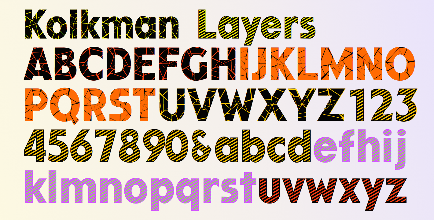
only outlines. This past year I again decided to try to use this material, which has since grown, in typefaces. After a dead end or two, I have mostly finished the effort and am now putting the resulting typefaces on myfonts.com. In this new effort I have both outline and solid versions of each pattern so that the user has much greater flexibility than with the first efforts. To aid the user in using the fonts, for each there is a gallery file in a pdf format that shows what characters are needed to get each tessellation pattern.

TessiePuzzlePieces contain puzzle pieces. The reason I created these shapes can be found at the link.
 TessieStandingBirds was a result from a quest to see how many different Heesch types I could illustrate with birds standing on the backs of other birds.
 TessieFlyingBirds has a large variety of flying birds. I tried to limit the use of characters that are not readily reached from the standard keyboard, so some flying bird shapes are on other Tessie fonts that are in the process of being put on Myfonts.com.
To get a tessellation pattern can require as few as one character but usually two, three, four, or six are required. The pattern above requires two characters because alternate rows are indented.

This illustration below shows three ways these fonts can be used. On the left is the solid style by itself, in the middle the solid style is overlaid with the outline style, and on the right the outline style is alone This shape is unusual because there are two ways to tile it. In the top six row of the picture, birds are flying both to the left and to the right. In the bottom four rows birds are flying only to the left.

For those who like the technical details of tessellations, the top birds are tiled as Heesch type TGGTCC while those on the bottom are tiled as Heesch type TG1G1TG2G2.

(Cross posted to mazepuzzles.blogspot.com)

Saturday, October 27, 2018

More overlays 2

Below are examples of more fonts that now can use overlays to easily display two or more colors.

With layering, there are colorful ways to use RoundUpShadow
 CourtGesture has a hollow top. Adding an "Inside" font with the same spacing allows one to fill the top with any color one wants. The rest of the font can also take on any color.
 ShadyCharacters was designed to remind one of trees. Here the "trees" have autumn colors that are provide with an overlay that fills in the hollow top.
FlagDay is an almost unreadable font. The striped style is layered on top of a solid style and on some of the letters below, there is an outline style as well.
It was derived from FourJuly.
There are more to come.

Thursday, October 25, 2018

More overlays

Recently I have taken apart several typefaces that were outlined or shadowed so that the parts could be reassembled in layers to give multicolored letters. (A first example is here.) Below are more examples.

First, LifeAfterCollege:
WurstchenOverlay:
It is probably possible to get these effects with some software, but with overlays many more programs can give the effect.

There were also some fonts that could be layered without any changes, such as Kolkman, which had shattered and striped versions.

Also Zebraw and Porker:


Wednesday, August 29, 2018

Revisions to XRoominghouse, deconstructing ValenteenaContour

I recently made some improvements and corrections to the dingbat typeface XRoomingHouse, available on MyFonts. The old version was not capable of producing the frames in the font poster below.
I have also been working on breaking apart some outlined or inlined typefaces. The result is that by layering the resultant fonts, one can get multi-colored letters. With the old version of ValenteenaContour, the ring and the inside kernel of a letter had to be the same color. Now each of the letters can have three colors, one for the inside, one for the middle ring, and one for the outside ring.

Wednesday, August 15, 2018

New from Ingrimayne: CemeteryWalk


CemeteryWalk was designed for a cemetery-walking-tour event. It features upper-case letters (derived from the font Roundup) on tombstones. It has two styles, a regular style with black letters on white stones and a bold style with white letters on black stones. It is caps only, with the lower-case letters having different shapes for the tombstones but the same letters as in the upper case. The regular style can be overlaid on the bold version to create colored letters on colored grave markers.
Now available at fontspring and myfonts.

Wednesday, July 25, 2018

FontSpring revivals

IngrimayneType has had a few fonts listed at FontSpring since 2015. Recently I have added most of the rest of the Ingrimayne Collection to the site. Included are several oldies that I had retired. One revival is Bouncer, which may have been the first typeface I designed. I designed a version not in Fontographer but with a freeware or shareware bitmap editor in the late 1980s and then did a PostScript version when I purchased Fontographer.
 IanSegoe was an early attempt at a medieval-looking typeface. Preliminary versions were named Laudens. I think Benescriptine is a more successful medieval-looking typeface but this earlier effort may fit some needs.
 I have put letters on a number of things, including bowling pins, coffee cups, placardsbuttonsChristmas ornaments, teapots, and even railroad cars. Stamper put them on stamps.
Monospaced fonts are an interesting challenge because wide letters and narrow letters fit are given the same space. With the demise of the typewrite, there is little use for them, but they still are fun to design. FeggoliteMono was an attempt to push the limits of what a monospaced typeface could look like. Long ago I did a variation that lessened its weirdness but gave it a slant. For some reason I never did a version without a slant until I added FeggoliteUpright at Fontspring.
These four all have limited uses and all are priced at the minimum price allowed on Fontspring, which is $5.00. The other typefaces I am adding have prices based on what they are on Myfonts.com.