Sunday, December 4, 2022

OverUnder

 OverUnder is a two font family that plays with the capabilities of the Opentype feature of Contextual Alternatives to alternate two sets of characters. One set is on tall vertical slabs and the other set is on wide horizontal slabs, and when the sets are alternated, the result is a pattern that has a woven appearance. 


It is available on fontspring.com.

Monday, September 12, 2022

Valsity, a squarish slab serif

Valsity is a squarish slab-serif family with five weights and two widths, each with an italics for a total of twenty members. With negligible  contrast, it is almost monoline. It is for decorative uses; it is too square and lacks the contrast to make it a good choice for extensive text.

Valsity began with a blending of two other squarish slab-serifs, Valgal and Kwersity, and its name reflects that ancestry. From there it took on a life of its own, often diverging from its parents.

Valsity is available from fontspring.


Friday, August 5, 2022

Lunanic

Lunanic is a geometric novelty typeface family with a touch of graffiti. The letters are formed from a circle with a notch or nick taken out, a shape that reminds me of a partial lunar eclipse. Half of the family have the nick on the left and half on the right. The faces are monospaced and there is no space between most of the letters so the filled styles cannot be used alone without tweaking. There are several ways to tweak them to make them readable: adjacent letters can be colored differently, the characters spacing can be increased, or an outlined style can be layered on top of the filled letters. The family does not have a true lower case. Most of the characters in the lower-case slots are alternates for those on the upper-case keys and they can be mixed in whatever way the user finds best. The family has twelve members: two orientations with three weights each and each of these six has an outline style to go with it.


Lunanic is available from fontspring and myfonts.

Font families expanded in 2022 include SJURecord (1 to 4), AbagailJackson (1 to 4), Talloween  (1 to 4), IanSegoe (1 to 2), BetterIngriana (6 to 10), & KampIngriana (5 to 10).

Sunday, July 17, 2022

Complements, not compliments


 In the typeface family "Complements" two sets of characters complement each other, so much so that they work together much better than they work separately. The two sets are designed to alternate and this alternating is done automatically in applications that support the OpenType feature Contextual Alternatives. Complements is purely for show and display; it is a horrible choice for text. The spacing is very tight, which works well for very large point sizes. At smaller point sizes the user may want to increase character spacing. The typeface is monospaced. If the spacing between words is too large, substitute the non-breaking space (or the underscore) for the space character. Complements is geometric, bizarre, and hard to read, all characteristics that catch the reader's attention.

Complements comes in two styles, regular and outline. The outline style was designed to be used in a layer over the regular style. It is available from myfonts and fontspring.

Monday, July 11, 2022

Another smooth blend

 Flyoika is a slab serif family with a fairly low x-height, long ascenders, and considerable contrast. The family has five weights, each with an italics and it can be used for either display or text.

Flyoika was not designed to meet a particular need but rather out of curiosity. Years ago I had designed two slab serif families, FlyHigh and Euroika, that I recently noticed had a lot of similarities and I wondered what a blend of the two would look like.  Several corresponding characters in the two families are considerably different and in cleaning up the results, I usually opted for simplicity. The name "Flyoika" reflects these origins.

Flyoika is available from Fontspring and Myfonts.  

In addition to two new text families released recently, I have expanded five other families: BetterTypeRight (9 to 12), Xabced (5 to 7), JasperSqueeze  (6 to 10), EuroikaKamp  (4 to 8), & BetterEuroika (6 to 8).

Saturday, June 25, 2022

Ratafly

Ratafly is versatile serifed font that can be used for display or text. The family has ten styles, with five weights and italics for each weight. 


 The name Ratafly is a reference to the origin of the family. It began by blending two very different serifed typefaces, Rataczak and FlyHigh. After a lot of cleaning up, the end result is a family that works better for book text than either of the parents.

Ratafly is available from Fontspring and Myfonts.

Monday, April 25, 2022

New families: Sansduski & SansduskiMono

As part of creating the unusual striped lettering featured in BigStripesMono, I designed a bold sans-serif set of upper-case letters.  A few weeks ago I decided to expand that set of letters by adding lower-case letters and more weights. The result was SansduskiMono. Its high x-height and tight spacing make it better suited for display and decorative uses than for blocks of text. Having put the effort into expanding the original typeface, it was a logical step to modify it a bit more by creating a proportional family from it, which is called Sansduski. Both families have twenty members, with an outline style that complements the black style and obliques styles for all the weights and the outline style. Both are appropriate for titles, posters, advertising, and other uses that benefit from simple letter forms that are geometric and clean. 


Both are available from myfonts (here and here) and fontspring (here and here).


Monday, April 11, 2022

TapeUp/TapedUp additions

TapedUp was a novelty font I designed in 2005 as a single-font family. I had used a template to produce several novelty/letterbat font with items such as hand tools and decided to use the template using a simple rectangular shape. The name was chosen because that shape could be a strip of tape.

In late 2021 and early 2022 I decided to add some family members. I created a bolder version and a shadow version, and then added oblique styles to yield a family of six. The shadow version can be used with the regular version to create two-colored lettering. Trying to update the family on myfonts encountered a problem as the file in their font platform seemed to be hopelessly corrupted and the solution was to resubmit it with a slightly different name.


TapedUp is available at FontSpring and TapeUp is available at Myfonts.

Tuesday, March 15, 2022

Two more alternating-characters fonts

In February and March I added teo more alternating-character fonts, fonts that are designed to alternate two sets of characters. Weaving could be considered a condensed version of Woven, though it does not have the tessellation properties of Woven. It comes in three styles, a thin, regular, and outline. The outline style was designed to fit over the regular style in a layer. Weaver is available from fontspring and myfonts.

FangsALot is a family of nine faces. The template shape on which all are based is a distorted triangle that resembles a curved tooth or a fang. The shape has four orientations from flipping and two are used for regular style and two for an italics style. Midway between these styles is an isosceles triangle and it is used for a third style. I did not think the fang motif came through clearly in these three fonts so decided to fill the fang shape with simple sans-serif characters and then reverse colors to allow layers. FangsALot is available from fontspring and myfonts.


Wednesday, February 9, 2022

Four more for 2022

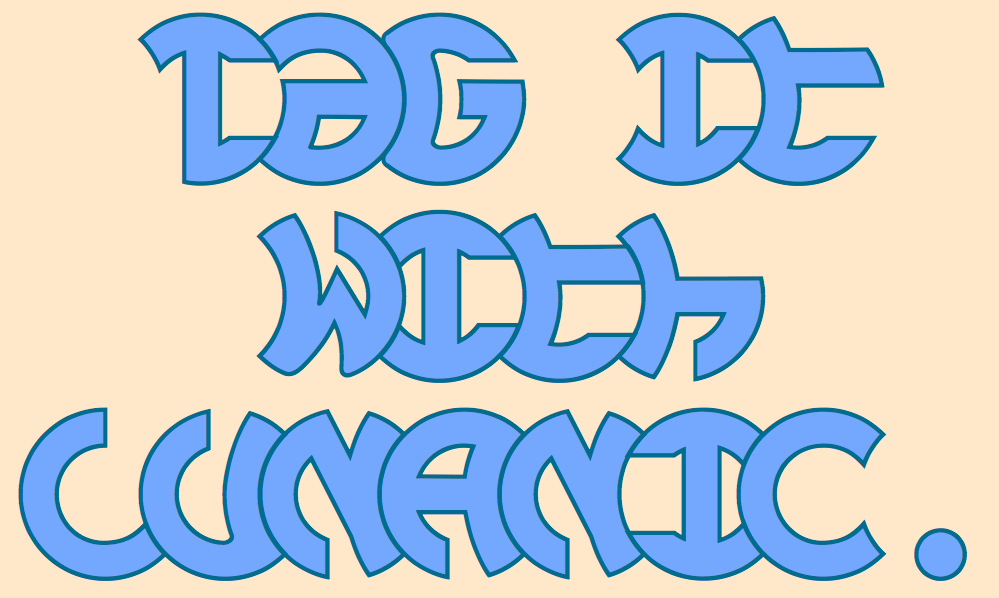
Typefaces with alternating characters have a tiny niche market. Because no one else has filled it, I decided I would. So far in 2022 I have released five typeface families into this niche, including the four below.

LoveDuets is similar to YinYangMessages and ButterflyWings in that it fills a single image with two letters. One set of characters fills the left side of a heart and the other set fills the right side. The OpenType feature of Contextual Alternatives does this automatically in applications that support it. There are several typefaces that put letters on hearts, but they all put one letter on one heart. The LoveDuets family has two styles that can be used in layers. It is available from fontspring and myfonts.

I started IMPuzzled a couple years ago but shelved it as I worked on other typefaces. This year I finally finished this family that puts letters on interlocking puzzle pieces. I have found one other font with letters on puzzle pieces, but its pieces are all identical. IMPuzzled has two styles and is available from Fontspring.

Woven was the first typeface I designed intentionally using a shape that tessellates as a framework in which to form letters. Like Woven, Billowed uses the framework of a simple tessellation pattern to form letters. Both Woven and Billowed can create lettering with a wave or ripple both horizontally and vertically. Woven has two styles and Billowed four. I have not seen any other typeface that resembles these faces. Billowed is available here and Woven here.

For the complete catalog of my alternating letter fonts, see here.

Tuesday, January 25, 2022

SlipperyFishes

In later 2021 I used alternating letters to give a line of text a wave. (See Undulate.) I realized that instead of having the waves on the top and bottom parallel to each other, I could have them reflect each other. This design idea gave birth to SlipperyFishes. The strange name came about because the look of a line of text reminded me of a slippery fish.

SlipperyFishes is monospaced with tight letter spacing to accentuate the ripple pattern. The family has four members: regular, outlined, condensed, and condensed outlined. The outline styles that can be used in a layer with their base styles to add color. 

Slipperyfishes is available from myfonts and fontspring.

A completely unrelated note: Myfonts listed their top 25 new fonts from 2021. The list includes 18 sans serif faces, 6 seriffed faces, and 1 script face.