Friday, January 17, 2025

A first font for 2025

2024 was a slow year for developing new typefaces. As the year ended,  I developed Scirckel, an experimental font whose lower-case letters and most of the upper-case letters contain circles or parts of a circle. It is sans serif but, because some of the letters shapes are a bit odd, probably not a good choice for long text. It may be useful when a sans-serif font with a bit of whimsy is needed. It was designed as an attempt to incorporate a circle in as many letters as I could. It is a decorative and somewhat weird sans serif.

There are alternates for six of the odder letters, the f, g, m, v, w, and z. The can be accessed in OpenType aware applications. The family has four weights and matching obliques.

It is available from myfonts and fontspring.

Thursday, October 17, 2024

Now on Creative Market

 The typefaces of Ingrimayne Type are now available on Creative Market. Creative Market purchased FontSpring at the beginning of 2022.


Wednesday, June 19, 2024

Family additions

 For the past two and a half years I have posted about new font families that I have developed but almost nothing about the many additions to existing families. This post provides a quick update about those additions.

In 2022 I greatly expanded the Youbee family by adding condensed and semi-condensed widths. The red letters in the picture below show original styles and the black letters are the new styles.

In 2022 I also added styles to many other text font families, including three to BetterTypeRight, two to Xabced, four to JasperSqueeze, four to EuroikaKamp, two to BetterEuroika, four to BetterIngriana, and five to KampIngriana. When these families were created twenty or thirty years ago, a family with four styles was considered a complete family. This is no longer the case.

I added oblique styles to fonts and families including Renslaer, Auldroon, RoundUp, TRGrunge, Swanville, VunderScript, and InsideLetters. Obliques are easy to add and may increase the usefulness of the families. I added outline and oblique styles to SJURecord, AbagailJackson, and Talloween.

I added 12 styles to the NewNerdish family. Included were a new semibold weight with oblique and ten new condensed styles.

Other families getting new styles were IngrianaCasual with six new styles, Dschoyphul with two, and CemeteryWalk with six. IanSego had a new style added and then later two obliques.

A final family with new styles is Grandecort with six. The yellow styles are new and the red styles are old.


 Grandecort may be the last family I upgrade for a while because I have had a great deal of difficulty making edits with the Monotype's Foundry Platform. I find that even small edits run the risk of causing big problems often unrelated to the item I am trying to fix. If Monotype ever gets its Foundry Platform fixed, I may see what else I can improve. 

Thursday, April 11, 2024

SanSeraph

     SanSeraph is a simple, clean, sans-serif font family that is highly legible and useful for both text and some display purposes. It is not meant to stand out but to blend in and let the reader focus on the meaning of the text rather than the look of the text. The family has 32 styles composed of three widths, two with five weights and the third with six, and each of these 16 has an italics style.


As the name suggests, SanSeraph is sans serif. 

SanSeraph is available from myfonts.

Wednesday, February 28, 2024

Revecon

Revecon is a new sans-serif typeface family from Ingrimayne Type now available on myfonts.com. It is a bit unusual because it has reverse contrast (sometimes called inverse contrast), that is, the letters are thick where normally they are thin and vice versa. Serif fonts with reverse contrast were popular in the 19th century for advertising and display purposes. As a result these fonts have an old-fashioned or wild-west look. San-serif fonts with reverse contrast have an uncommon look that is quirky and modernistic. Revecon is legible but seems inappropriate for lengthy text. It can be useful for display purposes such as advertising and similar uses where one wants something simple but a bit unusual and odd.

The Revecon family has three weights with nine styles. Included are three backslanted styles, adding a bit more quirkiness to an already strange family.

Monday, December 18, 2023

Decorate The Tree

It struck me in early December 2023 that my typeface Vinetters, which puts letters on alternating leaves, could be reworked to make a font of Christmas lights with alternating letters. I initially thought the name Christmas Lights would be appropriate but found that name was taken by a typeface that seemed to have little to do with either Christmas or lights. The name DecorateTheTree both captures a Christmas theme and is weird enough so others have not used it for a typeface.


DecorateTheTree is a festive novelty font family that is useful to display a holiday message not just in words but in the lettering itself. The family has two styles, a regular style with clear bulbs and the bold style with filled bulbs. They are designed to be used in layers. Further, the fonts use the OpenType feature contextual alternatives to alternate two sets of letters, one set with bulbs standing up and the other set with the bulbs hanging down. The end result gives the impression of a string of Christmas lights. (The characters on the bulbs are derived from the font SansduskiMono.)

DecorateTheTree is available from myfonts and fontspring.

Friday, May 5, 2023

DecoSpring: a font with flowers

DecoSpring is a decorative art-deco family that was inspired by one word in an advertisement in a 1978 edition of my local newspaper. I could not find a typeface that matched it so decided to create one, which became DecoSpring-Regular. It is caps only, with an alternative set of capitals on the lower-case keys. Characters with very thick stems invite interior decoration and I opted for floral decorations. DecoSpring-Flowers can be used alone or it can be layered on top of the regular style to create colored flowers as shown below. Changing the width of the bolder stem resulted in two more style, the light and thing styles. Another set of four styles, the Simple set, was formed by eliminating the split in the stems by merging the two parts. All the DecoSpring faces are display faces to be used in small doses, and especially the bolder ones, at large point sizes,

Seven of the eight styles are illustrated above. DecoSpring can be purchased from myfonts and fontspring.

Tuesday, March 28, 2023

Vasetters, another alternating-letter typeface family

Vasetters is a novelty font in which the letters are cut from the shape of a tessellating vase. To get the tessellating effect, the two sets of letters (and numbers and some symbols) must alternate, and this is done automatically in applications that support the OpenType feature of Contextual Alternatives (calt). Vasetters is monospaced and comes in two weights. The regular weight is tightly spaced, which should not be a problem at large point sizes. At small point sizes adjacent letters can be colored differently or the character spacing can be increased. The lighter weight can be used alone or layered above the regular weight to create the effect of hollow lettering. Vasetters is fun, bizarre, weird, and obviously a decorative display font.

Vasetters is available from myfonts and fontspring.

Tuesday, March 21, 2023

RensGazet

RensGazet is a decorative blackletter typeface with elaborate upper-case letters and condensed lower-case characters. It was inspired by the masthead of a short-lived weekly newspaper, The Rensselaer Gazette, which was published from 1857 until 1860. I could not find any existing digitized fonts that replicated this old typeface, so I decided to create an interpretation of it. I had samples of few letters in large point sizes and a number of others at a small point size, though these were blurry and not sharply defined. As a result, this typeface is undoubtedly considerably different from the original. Also, my spacing is much tighter than that in the source samples.

RensGazet is available from myfonts.com and fontspring.

Wednesday, January 4, 2023

NarrowWay & NarrowPath

In November, after seeing a number of highly condensed sans-serif fonts in use, I realized that my catalog was very weak in condensed fonts. I decided to create one and began with an elongated O. The rest of the letters were based on that width and height. This font became NarrowWay Ultracondensed. From there I altered it with thinner stems (Light Ultracondensed) and then widened it and created three weights for a condensed width. Widening this condensed width, I call the results a regular width, though it is still a very condensed font. None of these has a true lower case, but rather have alternative shaped letters, some based on lower-case forms, in place of a true lower case. I could find only a few fonts on myfonts.com that are more condensed than NarrowWay-Ultracondensed. 

After mostly finishing the 18 styles of NarrowWay, I decided to add a true lowercase to the widest of the three weights, and then also added the lower case letters to the other two widths. I spun these styles out as a new family, NarrowPath. Because they were very easy to create and because some people might find them useful, I added oblique styles for all the upright styles.

Previously the most condensed sans-serif font I had created was PeterPierre-Condensed, which I designed in 1992. It is shown below, above two examples of NarrowPath-Medium at the same point size. The first NarrowPath sample uses the font's spacing, which is quite loose. The second tightens character spacing to make it match more closely with the PeterPierre sample. The NarrowPath sample is smoother and more elegant than the PeterPierre sample.

NarrowWay and NarrowPath are available on Myfonts.com and FontSpring.com.

Sunday, December 4, 2022

OverUnder

 OverUnder is a two font family that plays with the capabilities of the Opentype feature of Contextual Alternatives to alternate two sets of characters. One set is on tall vertical slabs and the other set is on wide horizontal slabs, and when the sets are alternated, the result is a pattern that has a woven appearance. 


It is available on fontspring.com.

Monday, September 12, 2022

Valsity, a squarish slab serif

Valsity is a squarish slab-serif family with five weights and two widths, each with an italics for a total of twenty members. With negligible  contrast, it is almost monoline. It is for decorative uses; it is too square and lacks the contrast to make it a good choice for extensive text.

Valsity began with a blending of two other squarish slab-serifs, Valgal and Kwersity, and its name reflects that ancestry. From there it took on a life of its own, often diverging from its parents.

Valsity is available from fontspring and myfonts.


Friday, August 5, 2022

Lunanic

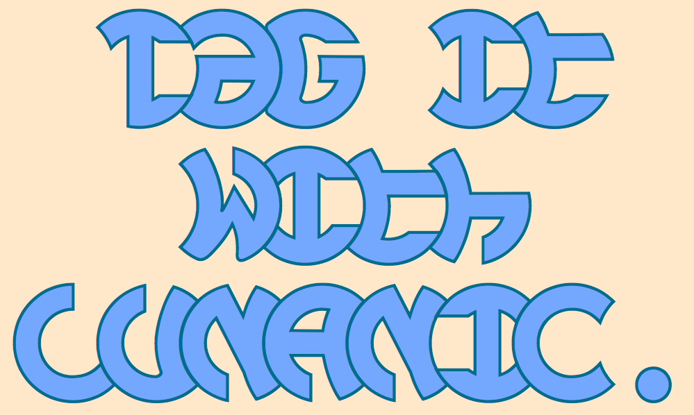
Lunanic is a geometric novelty typeface family with a touch of graffiti. The letters are formed from a circle with a notch or nick taken out, a shape that reminds me of a partial lunar eclipse. Half of the family have the nick on the left and half on the right. The faces are monospaced and there is no space between most of the letters so the filled styles cannot be used alone without tweaking. There are several ways to tweak them to make them readable: adjacent letters can be colored differently, the characters spacing can be increased, or an outlined style can be layered on top of the filled letters. The family does not have a true lower case. Most of the characters in the lower-case slots are alternates for those on the upper-case keys and they can be mixed in whatever way the user finds best. The family has twelve members: two orientations with three weights each and each of these six has an outline style to go with it.


Lunanic is available from fontspring and myfonts.

Font families expanded in 2022 include SJURecord (1 to 4), AbagailJackson (1 to 4), Talloween  (1 to 4), IanSegoe (1 to 2), BetterIngriana (6 to 10), & KampIngriana (5 to 10).

Sunday, July 17, 2022

Complements, not compliments


 In the typeface family "Complements" two sets of characters complement each other, so much so that they work together much better than they work separately. The two sets are designed to alternate and this alternating is done automatically in applications that support the OpenType feature Contextual Alternatives. Complements is purely for show and display; it is a horrible choice for text. The spacing is very tight, which works well for very large point sizes. At smaller point sizes the user may want to increase character spacing. The typeface is monospaced. If the spacing between words is too large, substitute the non-breaking space (or the underscore) for the space character. Complements is geometric, bizarre, and hard to read, all characteristics that catch the reader's attention.

Complements comes in two styles, regular and outline. The outline style was designed to be used in a layer over the regular style. It is available from myfonts and fontspring.

Monday, July 11, 2022

Another smooth blend

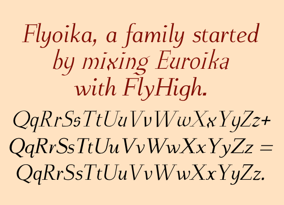
 Flyoika is a slab serif family with a fairly low x-height, long ascenders, and considerable contrast. The family has five weights, each with an italics and it can be used for either display or text.

Flyoika was not designed to meet a particular need but rather out of curiosity. Years ago I had designed two slab serif families, FlyHigh and Euroika, that I recently noticed had a lot of similarities and I wondered what a blend of the two would look like.  Several corresponding characters in the two families are considerably different and in cleaning up the results, I usually opted for simplicity. The name "Flyoika" reflects these origins.

Flyoika is available from Fontspring and Myfonts.  

In addition to two new text families released recently, I have expanded five other families: BetterTypeRight (9 to 12), Xabced (5 to 7), JasperSqueeze  (6 to 10), EuroikaKamp  (4 to 8), & BetterEuroika (6 to 8).

Saturday, June 25, 2022

Ratafly

Ratafly is versatile serifed font that can be used for display or text. The family has ten styles, with five weights and italics for each weight. 


 The name Ratafly is a reference to the origin of the family. It began by blending two very different serifed typefaces, Rataczak and FlyHigh. After a lot of cleaning up, the end result is a family that works better for book text than either of the parents.

Ratafly is available from Fontspring and Myfonts.

Monday, April 25, 2022

New families: Sansduski & SansduskiMono

As part of creating the unusual striped lettering featured in BigStripesMono, I designed a bold sans-serif set of upper-case letters.  A few weeks ago I decided to expand that set of letters by adding lower-case letters and more weights. The result was SansduskiMono. Its high x-height and tight spacing make it better suited for display and decorative uses than for blocks of text. Having put the effort into expanding the original typeface, it was a logical step to modify it a bit more by creating a proportional family from it, which is called Sansduski. Both families have twenty members, with an outline style that complements the black style and obliques styles for all the weights and the outline style. Both are appropriate for titles, posters, advertising, and other uses that benefit from simple letter forms that are geometric and clean. 


Both are available from myfonts (here and here) and fontspring (here and here).


Monday, April 11, 2022

TapeUp/TapedUp additions

TapedUp was a novelty font I designed in 2005 as a single-font family. I had used a template to produce several novelty/letterbat font with items such as hand tools and decided to use the template using a simple rectangular shape. The name was chosen because that shape could be a strip of tape.

In late 2021 and early 2022 I decided to add some family members. I created a bolder version and a shadow version, and then added oblique styles to yield a family of six. The shadow version can be used with the regular version to create two-colored lettering. Trying to update the family on myfonts encountered a problem as the file in their font platform seemed to be hopelessly corrupted and the solution was to resubmit it with a slightly different name.


TapedUp is available at FontSpring and TapeUp is available at Myfonts.

Tuesday, March 15, 2022

Two more alternating-characters fonts

In February and March I added teo more alternating-character fonts, fonts that are designed to alternate two sets of characters. Weaving could be considered a condensed version of Woven, though it does not have the tessellation properties of Woven. It comes in three styles, a thin, regular, and outline. The outline style was designed to fit over the regular style in a layer. Weaver is available from fontspring and myfonts.

FangsALot is a family of nine faces. The template shape on which all are based is a distorted triangle that resembles a curved tooth or a fang. The shape has four orientations from flipping and two are used for regular style and two for an italics style. Midway between these styles is an isosceles triangle and it is used for a third style. I did not think the fang motif came through clearly in these three fonts so decided to fill the fang shape with simple sans-serif characters and then reverse colors to allow layers. FangsALot is available from fontspring and myfonts.


Wednesday, February 9, 2022

Four more for 2022

Typefaces with alternating characters have a tiny niche market. Because no one else has filled it, I decided I would. So far in 2022 I have released five typeface families into this niche, including the four below.

LoveDuets is similar to YinYangMessages and ButterflyWings in that it fills a single image with two letters. One set of characters fills the left side of a heart and the other set fills the right side. The OpenType feature of Contextual Alternatives does this automatically in applications that support it. There are several typefaces that put letters on hearts, but they all put one letter on one heart. The LoveDuets family has two styles that can be used in layers. It is available from fontspring and myfonts.

I started IMPuzzled a couple years ago but shelved it as I worked on other typefaces. This year I finally finished this family that puts letters on interlocking puzzle pieces. I have found one other font with letters on puzzle pieces, but its pieces are all identical. IMPuzzled has two styles and is available from Fontspring.

Woven was the first typeface I designed intentionally using a shape that tessellates as a framework in which to form letters. Like Woven, Billowed uses the framework of a simple tessellation pattern to form letters. Both Woven and Billowed can create lettering with a wave or ripple both horizontally and vertically. Woven has two styles and Billowed four. I have not seen any other typeface that resembles these faces. Billowed is available here and Woven here.

For the complete catalog of my alternating letter fonts, see here.