Tuesday, March 17, 2020

Revision of DriveEddie

About twenty five years ago I designed several irregular typefaces (such as Grundee, Dschoyphul, SarahfSlob, and DrivEddie) of the type that could be used for advertising or children's books. SarahfSlob seemed the most promising of them, so I completed a family of regular, italic, bold, and bold-italic styles. The others were interesting but I neglected them in favor of working on other designs.

This year I decided to correct some problems with DrivEddie and as began working on it, I realized that it would be fairly easy to add a bolder version. Then I realized that an even bolder version and oblique styles might might the face more useable. The end result is that what was for many years a one-style family now has six. It has limited uses, but one of those uses might be for text in children's books.
Below are the six styles of the font.
In addition, I have updated six fonts that are sold on fontspring.com: IanSegoe, and early medieval type font; JasperSqueeze, an attempt at a serifed text font; Quatsity, a hybrid created by blending two other fonts; Stamper, in which letters outlined by a stamp shape; Swanville, a very early bold face; and XAabced, another very early attempt at a serifed text face. All but Stamper had additional accented characters added.

Friday, March 6, 2020

New family members: Kwersity and RummageSale

When I created RummageSale, I named it RummageSaleOne because I thought I might do a similar, second font of letters in a variety of styles. It took over twenty years, but there now is a RummageSale-Two. As a result, people creating lettering with mismatched type have four alternatives for each letter. In the sample below, the first two of each letter are from the original RummageSale and the second two are from the new RummageSale font.
A second family adding members is Kwersity. It had four members, Kwersity, Kwersity-Bold, KwersityWider, and KwersityWider-Bold. These have been renamed to Kwersity-Regular, Kwersity-SemiBold, Kwersity-Wide, and Kwersity-SemiBold-Wide. New bolds were constructed for both the narrower and wider styles and a shadow style was created based on Kwersity-SemiBold. The SemiBold style can be layered on top of the shadowed style to create bi-colored lettering.
Corrections and additional characters (especially the accented characters used in Eastern European languages) have been added to Handmade Font, DearJohn, Barefoot, Crippled Font, and ShirlyUJest.

Wednesday, February 19, 2020

New family members, Seasick & Pedestrian

In the past few weeks I have increased the Pedestrian family from one member to three members. Pedestrian is a strange font that cuts bits from footprints to make letters. The original font had right feet with toes facing up as upper-case letters and right feet with toes facing down as lower-case letters. As I was adding accented characters, I realized that the absence of left feet made the family feel incomplete. I could have added a left-foot counterpart to the original font, but instead I added two fonts, one with all the toes facing upward and a second with all the toes facing downward. Below are samples of the three members of the Pedstrian family with the original member shown first.
Pedestrian has limited uses but what surprises me a bit is that it actually is quite readable.

The other family that added new styles is Seasick. It is a distorted version of Kwesity and although I am not sure what uses it can have, I like it. I added light and extrabold styles to both Seasick and Seasick Mirror. They both wobble, but their wobbles mirror each other. The new members of the family are shown in black below.
In addition to changes in these font families, I have made corrections and added characters (especially the large group of accented characters used in Eastern European languages) to Chainletter, KlipJoint, NeedALilly, PutMyFootDown, RedLetter, SafetyPinned, TackyFont, and Zarrow.

Thursday, February 13, 2020

More expansions

I have expanded two more font families as 2020 gets underway. PhrackSle has two new weights to bring the total to four. The new weights are shown in black and the old in blue.
SarahfSlob has expanded from four fonts to ten. Again the new weights are shown in black.
Irregular seriffed faces such as SarahfSlob are sometimes used in children's books and to suggest this use I added this poster:

Both families are also available on fontspring.com, here and here.

Wednesday, January 22, 2020

FeggoliteMono reimagined

During my prime as a typographer, I was fascinated with monospaced or typewriter fonts. I am not sure the reason for this interest, but I ended up designing quite a number of them.

Possibly the strangest of my monospaced designs was FeggoliteMono. It was an attempt to create a decorative face that could have been done on a typewriter.  Although it had no obvious uses, I kept toying with the design, seeing what else I could tease from it. I tried to make it more legible, and then I distorted that variant and put it in boxes. As 2020 began, I noticed that neither of the two weights of the original was a true bold, so I decided to add one.

As I played with it, I thought an italics might be a useful addition and I was surprised to find that what I came up with seemed to be a better attempt at a monospaced, decorative typeface than the original. I had never been happy with the original y and the original g was also funky, so I redid these glyphs, keeping the original y as an alternate that can be accessed via an OpenType stylistic alternative.

Because the family is monospaced and each weight has the same character width, for many of the characters one can overlay the thinner weights over the bolder weights. An example is shown below.
For more information, follow the link. The family is also available on fontspring.

Monday, January 20, 2020

Revivals

I have revived three old type families that I had abandoned for many years. They were all hybrids, that is, they were created by blending versions of other fonts that I had constructed. They were not created to serve any purpose but rather were the result of my curiosity. Fontographer had been given the ability to blend two existing fonts (which can be very useful for creating different widths and weights) and I wanted to see what would happen if I fed the blending process various fonts.

Some of the results were attractive and some less so. The fonts created by blending in KampFriendship, a hand-drawn font with serifs, seemed less pleasing than other blends, so I set them aside when I began to list fonts on myfonts.com. However, they are very legible at small point sizes and someone somewhere may find a use for them. I have cleaned them up (blending can leave a lot of oddities, especially when mixing two quite different fonts) and added new styles to two of them. They are now available on fontspring.com

Examples of the three font families are shown below with a sample from the plain and bold-italics styles. The font families are, from top to bottom, EuroikaKamp, BetterKamp, and KampIngriana. For more information, follow the links.


Wednesday, January 15, 2020

Bigger families

For much of December I worked on adding additional weights to three font families.  The revised families are now available on myfonts.com

Euroika has six new members: light, light-italic, semibold, semibold-italic, extrabold, and extra-bolditalic. Below the new weights are shown in black  and the old weights in blue.
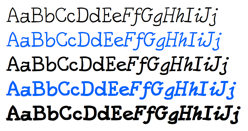
KampFriendship also has six new members: thin, thin-italic, semibold, semibold-italic, extrabold, and extra-bolditalic.
Ingriana has four new members: light, light-italic, semibold, & semibold-italic.
All families added more OpenType features. Each now has superscript and subscript numbers that can also be used to form fractions. Euroika and Ingriana also have monospaced numbers that can be accessed via OpenType. Below the sets of regular and monospaced numbers are shown for Ingriana.
As you can see in the above samples, both Euroika and Ingriana have non-traditional italics. None of these fonts was constructed with a specific purpose in mind.

When these font families were constructed in the early to mid 1990s, a complete font family consisted of plain, bold, italic, and bold-italic. Now some of the new font families appearing on myfonts.com have over 100 family members.

(These typefaces are also available at fontspring.com. See here, here, and here.)