Friday, December 27, 2019

TessieLetters and an unusual alphabet

I have finally returned to and finished a series of TessieLetter typefaces that complement the eleven Tessie typefaces (here, here, here, and here) that allow one to create tessellation patterns of birds, animals, bugs, and variety of other shapes. TessieLetters is made up of seven different fonts (each in solid and outline styles) that contain all the letters of the alphabet as well as the numbers. You can find them at fontspring.com: here, here, here, here, here, here, and here and at myfonts here.

One of the seven in the series contains only shapes that can be tessellated using a single key. Somewhat surprisingly, I was able to find ways to do the complete alphabet in this way, though some of the letters require a bit of imagination. (U, T, and G are not ideal.) A breakthrough came when I figured out a way to form the letter P. The same shape works for lower-case b, d, q and letters 6 and 9. Below is a picture of the entire one-key tessellating alphabet.


All these patterns would fit as Heesch types TTTT or TTTTTT. Many have symmetry that would allow them to fit in other Heesch types as well. Also, for several letters (such as f, h, m, n, s, and z) there are multiple shapes that work.

I am unaware of anyone else who has constructed an alphabet with this property.

In the spirit of the season:


(Cross posted at mazepuzzles.blogspot.com)

Tuesday, November 26, 2019

New styles for the fall (3)

Jennerik is a very simple, monoline serif font. The plain version was originally created to print rough drafts on ink-jet printers. Because it is mildly condensed and quite thin, it saved on the use of paper and ink. Bold and extrabold versions were added before the typeface was offered for sale.

A recent revision takes this typeface family from three members to eight. A new weight, light, is added and then italic versions of all weights were added. The italic versions of the lower case letters had been created many years ago but never added to this family. Instead the forms were kept upright and combined with some unusual caps to form a new family.
 Along with the addition of new family members, the family received some OpenType features.
The name reflects its simple, unpretentious style.

Tuesday, November 19, 2019

New styles for the fall (2)

The Jabced family is an attempt to do a standard, serif typeface family suitable for large blocks of text. It works but will never challenge the commonly-used faces for this purpose and its price reflects that. The recent revision added two new weights, semibold and extrabold.
 In addition, the update added several OpenType features.

Updating the Yngreena family added a light weight to both Yngreena and YngreenaAlt.  Yngreena and YngreenaAlt differ in about ten characters. Examples are the Y, g and t in the picture below. The former is more exuberant and the latter is more restrained and therefore better for text.
 Included with the Yngreena family is an extrabold striped version that I did long ago and included on myfonts. I took the opportunity of the revision to change it so it would better work in layers with the unstriped extrabold version.
Some but not all weights support OpenType inferiors, superiors, and fractions.

Wednesday, November 6, 2019

New styles for Fall (1)

I have added more weights to several typefaces. First up is the revision of the Youbee family that adds two new weights, light and semibold.
The revision adds a number of OpenType features to all weights including some discretionary ligatures and superscript and subscript numbers. The superscript and subscript numbers can, with the OpenType fraction feature, be used to form fractions if the application supports this feature.

The revision of the TiredOfCourier family adds a semibold weight to the existing three weights.
The fonts in the family have some added characters, including common fractions and superscripts and subscripts that also can be used to form any fractions with the OpenType fraction feature. The OpenType feature of stylistic alternatives provides easy access to most of the picture or icon elements that are included in the regular style. (These pictures and icons are not included in most of the other weights.)

Wednesday, October 2, 2019

A generic sans

Sans-serif typefaces dominate in places where large type is used such as titles and advertising. Recently on myfonts.com 46 of the 50 best-selling typefaces were sans serif. Serif type is still used extensively where lengthy text is needed such as in books, magazines, and newspapers, but it does not sell well.
When updating Galexica by adding five styles to the existing five styles, I noticed that my limited offering of sans-serif type had nothing comparable to the superfamilies of sans serif type that have proliferated in recent years. Although the world does not need yet another sans-serif typeface, I could not resist the challenge of creating my own super family.
The result is the 30 styles of Yassitf. It has three widths: condensed, narrow, and regular. The regular has six weights, the narrow five, and the condensed four. Each of those weights has both an upright and an italic version. It is now available on myfonts.com
Creating Yassitf gave me the opportunity to further explore opentype features that I had not previously used. I learned that some of them can add a lot of functionality to a typeface. Going forward, I may add some of these features to my existing faces.

Tuesday, September 24, 2019

Another upgrade: Galexica

The eccentric sans serif font Galexica now has five more family members. Previously it had five: regular, bold, extrabold, italic, and bold italic. The added five are extrabold italic, thin, thin italic, black, and black italic.


Although it is a quirky font with odd letter forms, it is surprisingly legible.


It is available on myfonts.com.

Wednesday, August 7, 2019

Star tilings

In making maze books, I used a number of tiling patterns that featured stars of various kinds. Over the past month I gathered them, corrected them where necessary, and filled in some obvious gaps when I looked at what I had, and then issued the results as a two font family, IngyStarTilings. It is available on myfonts.com.

Here are a few examples of what kinds of patterns it can produce. (Note, most of the patterns require two characters.)
 Above, an eleven-pointed star and an eight pointed star. Below four-pointed stars and three-pointed stars.

Stars do not tessellate so I could not use these patterns in my various tessellation patterns.

A complete listing of the patterns I could make with the typeface is at ingrimayne.com/fonts2/SamplesStarTilings.pdf.

(Two other typefaces that feature stars are XStellaStern and XStarsAndStripes.)

Tuesday, June 4, 2019

More fun with coloring fonts

I have recently added more color options for several typefaces sold on myfonts.com. Tuskcandy and HippityDippity have inline or outlined styles, and now the outside ring, the middle ring, and the inside letter can all be set in different colors.
 WyomingSpaghetti-Bold added a thin outline style that was created for use in layers.


AccruedInterest is a sloppy, outlined font. The middle now can be used alone or in layers with the original.
A couple of added characters give more options for TOCinRings. Below a blank red disk has been placed behind the lettering and a black ring has been placed above the letters. The effect can be obtained with layers or using keys that have zero width. A pdf file that can be accessed from the description on myfonts explains both ways.

Karlisbad has grown from a single-font family to a family of three with two variants that have the lines removed. Below the regular variant is used to create text where the letters and the lines have different colors. The extra light variant is given the same color as the background and the result is hollow lettering, a reading-between-the-lines font.

Tuesday, May 21, 2019

More shadow separations

I have added shadow-inside styles to more typefaces on myfonts.com. The separate inside style makes it very easy, using layers, to create more colorful lettering. Here are recent additions.
Links to myfonts are Smokehaus, OakPark, Anarchhie, WyomingPastad, WyomingMacroni, LineDrive, Rundigsburg, and Kneebls.

Monday, April 22, 2019

A few more updates

In the past few months I have been posting about upgrades to typefaces on myfonts.com. Here are five that I have not yet mentioned.

I added outline styles to two typeface families, Letrinth and ValGal. They can be used alone or in layers, as illustrated below.

A few month ago I added an upright version to FeggoliteHatched and recently added thin and bold styles. (The plain style is in the middle)
I wanted to allow the various decorated styles of the FiveOh family to be used in layers over the undecorated or plain version. I originally had the plain style and one of the decorated styles on one font (using the upper-case letters for one and the lower-case letters for the second). I moved the decorated letters to a new face and then finished it by completing another set of decorated letters that I had begun years ago but had not completed. Below are FiveOhTwo and FiveOhThree alone (on left) and layered atop FiveOhOne (right).
In reworking the various styles of Glitzy to allow them to more easily be used in layers, I made changes to some of the characters but did not add any new family members.

Thursday, April 11, 2019

Adding layers

In the past few months I have updated several typeface on myfonts.com by breaking apart shadowed and inline styles. With the parts separated into different faces, it is easy to create colorful lettering using layers. Below are examples of two-colored lettering for shadowed versions of LetunicalNewNerdish, and Phraxtured.  The results are shown over both white and gray backgrounds.
 Inline styles can be separated into three components: the inside, the middle ring, and the outside ring. Below are two fonts, Letunical-Inline and WurstHassen, that been decomposed, showing how the different components can be combined to produce two or three-colored lettering.
When I began breaking the inline faces into their parts, I made three separate typefaces of parts. (See LifeAfterCollege, for example.) Then I realized that I needed only two of the parts because the original typeface could serve as the base.

Because printing and displaying a font converts the mathematical outlines to a matrix of dots and those dots will not exactly match the outline, the order in which the layers are placed will affect how the end result appears. For example, here is Letunical with the a black middle ring in the top, middle, and bottom layer.


In the past week or two Myfonts has changed the way that fonts are displayed for purchasers. The changes are designed to give buyers easier access to the information that is most useful to them. The new display no longer has a "gallery" tab that displays whatever images the font designer uploaded. The only images that a buyer will now see are those that qualify as posters, images in png format at least 1440 pixels wide and twice as wide as tall. The gallery still exists and I have a number of documents there, mostly pdf files, that have special instructions. I think I have been able to link to all of them from the font descriptions.

Also discontinued are the images that Myfonts started with, square font flags that originally were 200 by 200 pixels. They may still be used on their old test site.

Sunday, March 31, 2019

More updating

Earlier this year I updated a number of typefaces on myfonts.com.

I realized that by adding just a few characters, I could increase the color possibilities of fonts which have letters on things. Below are examples for CoffeeMug, FeggoliteKeyed, JetJaneButton, NewLibrary, and Teapot.
These results can be obtained either by using layers of by multiple keys using characters with zero width. 

In several other revisions I added additional faces that must be used in layers. For the typeface Brrrrr the snow was isolated. Below the regular Brrrrr typeface is placed on a dark dark blue background and then the isolated snow style is colored white and layered above the base layer. 


Two new styles were added to the MedicineShelf font, a style that has only the outline of the bottles and a solid bottle style. Below the solid style is the bottom layer, the regular MedicineShelf style is the next layer, and the final layer is the outline of the bottles. 


Two new styles were added to the whimsical Concavex typeface, an outline and a style that has the interior of that outline. When I finished I realized that I needed only the outline and original styles to get any of the effects that I wanted.


The shadow of the PhederFrack-Shadowed has been separated out and when used in a layer, can give the shadow a different color than the letter.


The Salloon family had a number of additions and changes. There are three new styles that contain interior decorations that can be layered over SalloonWide and Salloon. Salloon has an outline style, and the various filled members of the family were altered so that they could be layered over the regular version of Salloon for additional coloring. 


Wednesday, January 30, 2019

Something new, something old

Several font families from IngrimayneType have recently been added to myfonts.com.

Bouncer was the first typeface I designed. The original was a bitmapped font done with a shareware or freeware program in 1988 or 1989 and it was later redone as a type 3 PostScript font. It has a simple design: bits of a circle are removed to make the letters of the alphabet. Lower-case letters are smaller versions of the upper-case letters.
As I was reviving this old font, I decided to play with the circle theme a bit more. BouncerTwo is based on interlocking circles with bits cut out to make the letters. It is visually striking but quite hard to read.

When searching for some family history in an 90-year-old college student newspaper, I was struck by the lettering of the title. Examining it closely, I realized it was hand drawn. I thought it was be an interesting challenge to complete the alphabet based on the three upper-case and nine lower-case letters. SJURecord is the result.
In the mid 1990s the makers of Fontographer gave it the capability to blend two typefaces if the points defining it lined up correctly. I played with that capability to produce several hybrid fonts. One was a blend of RoundUp and WyomingSpaghetti. Until this year I had not submitted it to myfonts.com. It there now, RoundWhy, in two weights.

Thursday, January 24, 2019

Two more tessellation fonts

The addition of two more fonts of Escher-like tessellations at myfonts.com brings the total of the new tessie series to eleven. Four are of birds, one of other animals, one of bugs,  one of puzzle pieces, and four of everything else.

One of the recent additions is TessieBugs. It contains tessellating butterflies, moths, ants, and other creepy, crawly insects.

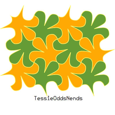
The other is TessieOddsNends, a hodgepodge of things that did not make it into any of the other ten faces.
Each contains two styles, a solid style that must be colored in order to see the shapes (after all, a tessellation fills the plane with no gaps or overlaps), and an outline style that can be used alone or layered over the solid style.

Thursday, January 17, 2019

New fonts for Halloween and Christmas

Until recently the InsideLetters family had only one family member, InsideLetters. An upgrade that was added to Myfonts.com at the beginning of January added two more family members, InsideLettersHalloween and InsideLettersXmas. The first puts the letters from InsideLetters on pumpkins and the second puts them on Christmas tree ornaments. Most of the characters in these two additions already existed in remote unicode slots in the typefaces Brrrrr and HeyPumkin but only the most patient would want to dig them out and use them. These new faces make them easily available.
 In addition, by using layers or by using several characters that are zero-width, the lettering can have three colors: the letters themselves, the outline of the pumpkin or ornament, and the color of the pumpkin or ornament. There are files in the gallery that explain how this can be done.

Thursday, January 10, 2019

More upgrades, Dec-Jan 2018-9

I continue to separate outlined and shadowed typefaces into parts so that the parts can be used to create more interesting colored lettering. Several of these have recently been installed at myfonts.com. Below are what the additions can do for AlbertBetenbuch, AndrewAndyCollege, and BeneCryptine.

The last font is shown above is FeggoliteHatched. What is shown above is a new member of the family, the one that should have been the first done but was not. I may still add some additional members to this family. It is monospaced as are typewriter font, but no typewriter ever had lettering like this.

Below are samples showing what layering the inside of a shadowed font on the original can produce for Gothamburg, Ingone, and MuskitosCaps.

I had two shadowed versions of NeuAltisch and the separated parts are layered with the originals in the top two samples below. Fortunately I did very few shadowings in the manner of the second sample because the same effect can be obtained by layering any font. Put down the base layer and color it with the desired shadow. Copy the layer, color it the background color, place it on the base layer and offset it a bit. This layer will create the gap between the letter and the shadow. Copy the second layer, color it the desired color of the top layer, and offset it a bit from the second layer.

The two bottom fonts, Vglee and WyomingStrudel, had interior ornaments. By separating out the ornaments, they can be colored and put back in layers. It would have made more sense to leave the base font plain and but that is not how the typefaces were developed.

A final font family with additions is Grandecort. The one striped style, which was all caps, has been expanded to three: all stripes, bottom stripes, and top stripes. A new all-caps background font has been added to give color to the stripes. Also, the shadowed version of the family has had its interior extracted as a separate font so it can be layered with the original.

Some of these results can be obtained with drawing or publishing software, but
these additions make the effects easy to obtain with any program that allows layers.